Disease and medical health is an important scientific field that is directly related to everyone. Scientists have been paying attention to the application of interdisciplinary techniques in the process of exploring the mysteries of life and the production of diseases. Nowadays more and more emerging technologies are being applied to the medical field, such as virtual reality-based simulation surgery, surgical robots, medical imaging technology, medical image processing and big data analysis, which also improves the safety and security of patients in the course of medical treatment.
Data visualization, originated in computer graphics in the 1960s, refers to the technique that uses computer graphics and image processing to transform data into graphics or images and interact with them.
In news reports, data visualization can be presented in a graphical way by acquiring, filtering, processing and analyzing data, which can not only make the audience obtain information more efficiently and intuitive and comprehensively, but also predict the trend of events through the law of data presentation and achieve in-depth and shallow reporting effect.
In general, the data visualization types of disease research can be divided into four categories:
- popular science introduction
- statistical summary
- geographical analysis
Popular science introduction: the basic common sense of the diseases
Data visualization is an effective tool for simplifying complex disease characteristics, relationships, or characteristics.

The figure above is a good example. Disorders and genes are nodes in the graph. A disorder’s size corresponds to the number of genes known to be associated with it. The dataset for this visualization is extracted from the Diseasome project by Mathieu Bastian and Sébastien Heymann. Using visualization methods we can simplify the relationship among disease and have a better knowledge of the dataset.
Statistical summary: statistical characteristics of diseases
We can present the distribution of patient’s age, gender and other health condition to find out the law of disease transmission and disease characters and make prediction about the disease.

The figure above shows the relation between heart disease and age. The bar chart reveals the distribution of patient’s age. The curve for the normal distribution (red line) and median value (blue dashed line) of all patients are overlapped on both figures and the median is shown as a blue dotted line. The box-and-whisker plot presents more numerical features of ages with/without heart disease.

Besides reflecting a static trend of certain feature, we can also add animation to visualize multi-variables’ influence on certain disease.
In this figure, we want to depict how many males and females were diagnosed with a disease and the ages at which they were diagnosed, so a stacked histogram is used to compare the effect of different ages and sex. Each of the columns is outlined in white to ensure that the different colors can be distinguished from each another if someone prints out slideshow in grayscale. People can reduce their risk by going to the hospital regularly to check on their chances of having diagnoses according to this image.

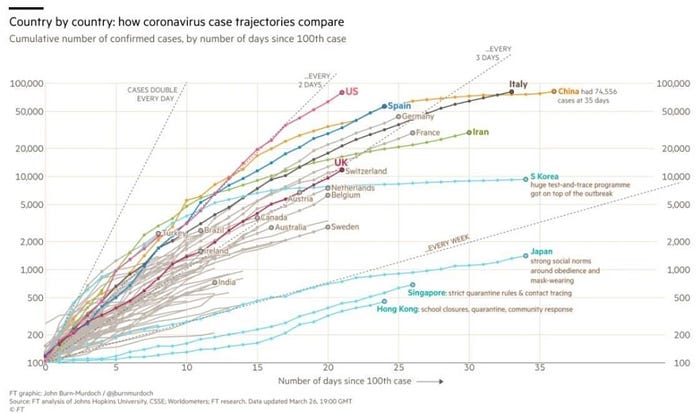
Through data visualization, we can also compare the spread speed of a disease among various countries. This is a curved, two-to-several chart updated daily by the Financial Times, showing the growing rate at which the number of new coronary pneumonia infections is spreading across countries.
As can be seen from the map, as on March 26, the spread of the outbreak in China has been controlled. On the contrary, in the United States, the United Kingdom, Spain, France, Germany, and Italy, the number of new cases per day is staggering, and for the time being we cannot see the direction of the inflection point. The United States, in particular, is outpacing any other country.
Geographical analysis: the geographical characteristics of disease
Outbreak map is the most popular way to visualize outbreak data. Provinces and cities as well as street communities, can be presented on map combined with data form. On the basis of the covid-19 map, combined with LBS location and other data information, the public can query the outbreak dynamics in their own region. In addition, through thermal efforts, scatter charts and other forms, it is also possible to better present information beyond the raw data, such as the trajectory of confirmed patients, so as to better carry out covid-19 prevention and control work.

From the map above, the size of circle indicates the severity of covid-19 in certain region. We can see the North America, Europe and China suffer the most from this global outbreak.
Data visualization plays an important role in many aspects of disease research. However, the research in this area is still at a relatively early stage. Although there are still many problems to be solved, there exist challenges and opportunities.
For instance, from a data point of view, how to integrate large-scale heterogeneous disease data for simple analysis is still a major challenge. How to combine and present different types of data from a variety of channels and build correlations between them, how to make it easy for people to observe and summarize from different perspectives, and how to help them aggregate and understand the results of the corresponding analysis are still important challenges for data visualization technology.
